[ 12 ]
Choose-Your-Own-Adventure Stories and Modular Design
One Page for Every Athlete
In 2011 I was working with a very talented team at my most memorable project to that point, the BBC London 2012 Olympics website. Our job was to work with the rest of the BBC Olympics team and create one page for every athlete, every sport, every country, and every venue, and then of course there were the results and the schedules. It was a massive project with a very hard deadline. I was part of the team that worked on the country, venues, and athlete pages.
The athlete pages in particular formed a challenge in terms of making sure they’d work for every single athlete. The template we defined for athletes had to work for the likes of Usain Bolt, who has participated and won medals in previous Olympic Games, and was likely to win medals in the London Olympics too. News stories were written about him frequently, and he was mentioned in other stories about his country and the events he was competing in. On the other end of the spectrum, we had athletes who’d never come close to winning a medal, and who most likely wouldn’t win any during the London Olympics either. Some of them came from countries with so few athletes that there may not be a single news story about them or their country. These were just some of the complexities we were working with.
When we started working on the BBC Olympics project, the redesign of BBC Sport was coming to an end. We had to work within the core templates already defined by BBC Sport, but had freedom, within the guidelines, of what modules we could show and, to some extent, where. This was the first dynamic build project for the BBC, and by keeping the core templates the same and setting rules for when to display the various content modules and the variations, we were able to design and build something that would adapt to every single country, sport, venue, and athlete. This was not a small undertaking, but a rather magical one.
It was by no means a simple project, but it was made possible by minimizing variations and having clearly defined rules. The enormous scope of the BBC coverage, the sheer number of website visitors of varying ages, digital and tech savviness, as well as interest in and knowledge of the Olympics and its sports, made this project an incredibly fascinating one.
A lot has happened in technological developments since then, and more devices have also come to market. We’re now at a point where experiences that are tailored and personalized to the individual are more possible than ever before. We, as the authors of the experiences, have the ability to tailor our story to a specific user based on who they are, where they physically are, what they know, what we know about them, and where they are in their journey. That specificity is incredibly powerful, opening possibilities to design and deliver experiences that can help users in their everyday lives, as well as to provide moments of delight. It also offers great possibilities when it comes to modular design in a multidevice landscape. With no two users’ journeys being the same, and their backstories, needs, worries, and more all slightly different, we also have an opportunity to allow users to choose the kind of experience they want. This is similar to CYOA books.
CYOA Books and Modular Stories
When you think about the nature of our experiences online, rather than being akin to a traditional linear story, they resemble that of gamebooks. Gamebooks—also called CYOA stories, after the Choose Your Own Adventure series that made the genre popular in the 1980s and 1990s—contain multiple storylines and possible endings. In the Choose Your Own Adventure series published by Bantam Books, the stories are written in second person, and readers take the role of being the protagonist (Figure 12-1). After reading a few pages, they’re faced with two or three options for actions the protagonist could take. Based on that choice, the reader will jump backward or forward to a particular page where they’re faced with yet more options, all of which will determine the plot’s outcome and lead to an ending. The number of possible endings isn’t set, but varies from as many as 44 in the earlier books to just 8 in the later adventures.
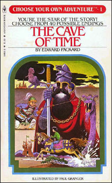
Figure 12-1
The Cave of Time by Edward Packard, the first book in the Choose Your Own Adventure series published by Bantam Books
CYOA has also given rise to hypertext fiction, which is a form of electronic literature. In hypertext fiction, users move through the story by clicking hyperlinks that take them from one node to the next in the narrative. The term hypertext fiction is sometimes also used to refer to traditional nonlinear literature, in which internal references provide a kind of interactive narrative. Collectively, the term interactive fiction (IF) can also be used, though that also refers to a type of adventure game in which the entire interface can be text only, or text with some accompanying graphics.
The main thing about all of these slight variations or CYOA―is that they allow the user to participate in the story. Unlike novels, where the reader is passive and the author has decided in which order the narrative will be told, CYOA stories (like games) enable the reader to be active, making choices about characters and which way the story will unfold. In this sense, the reader of CYOA stories becomes more of a “user” than a “reader.” The fact that they are in charge of how they want to experience the story makes CYOA very relevant to the context of product design.
CYOA and Product Design
The multiple storylines, decision points, and possible endings in CYOA stories are similar to the way users experience our products and services. As we covered in Chapter 3, users will increasingly land in the middle of the experiences that we create rather than right at the beginning. Any given page generally has more than one CTA (whether a primary or secondary one), that when clicked or tapped takes the user to a different page or view in the experience. Just as in the CYOA books, this action may take the user to an earlier page or view—for example, the home page—or to a later one, based on the way we’ve planned out that a user ideally should move through our website. In product design, however, we need to make sure that the storyline and the experience still delivers no matter where the user lands when they first come to us, as well as subsequently based on what they choose to click or tap.
Chapter 10 covered branching narratives in the form of main plots and subplots, and in Chapter 11 emphasized the importance of knowing the story you’re telling and ensuring that a red thread runs through it. CYOA brings to product design a good metaphor and framework for thinking through the now somewhat chaotic experiences that we design for. Increasingly, we should be able to let the user determine how the product experience story should unfold.
In CYOA books, the content is planned out so that different storyline combinations can work. Though there are fewer variations compared to the range of possible combinations of entry and exit points for the products and services we design, and possible journeys in between, the need to define these variations is something that we see in product design too. On the BBC Olympics project, we weren’t directly involved in defining the rules and possible variations of content for the different pages (e.g., athlete pages). As with most things, product design should ideally be a collaboration across disciplines. The main point is that someone on the team owns the job of ensuring that content is thought through and that the right “rules” are set, related to what to show when, where, and for whom. That way, the experience works in all instances and the narrative comes together no matter what choices the user makes, just as in CYOA books.
The Case for Modularity in Product Design
When you think about how CYOA stories are structured, you can see they’re made up of multiple parts just like website and app pages and views. When we worked on the BBC Olympics website in 2011, responsive design wasn’t yet common practice, but even so, we approached the design in a modular way. We took this approach to allow the pages to be published dynamically. Whether it’s for building dynamic pages or simple responsive websites, approaching design in a modular way has to do with standardizing how content and features are presented as well as ensuring that the content can be displayed on as many devices as possible.
Web designer and consultant Brad Frost writes, “Get your content to go anywhere because it’s going to go everywhere.”1 We’re not yet at a point where “everywhere” is possible, at least not in the fluid and seamless way that we’ve seen in various movies like Minority Report and concept videos like “A Day Made of Glass.” As Urstadt and Frier wrote, it’s not difficult to imagine what the future will be like; the difficult part is getting there.2 While we can’t future-proof anything, Frost writes, we can make sure that we make is as future friendly as possible, and part of that is ensuring that what design can go on as many devices as possible.
The future of apps might lie in them sitting in the background, pushing content in the form of cards to a central experience, says Paul Adams, SVP of product at Intercom. The apps would be like notifications rather than working as they do today, with each app having to be opened on its own.3 As Adams mentions, cards are already a big pattern in design. From Pinterest to Google Now, cards are used to deliver bite-sized content, and the benefit of their modular design is that they can be displayed on a large array of devices. You can also easily imagine what these cards would look like in smart mirrors, interactive surfaces, car interiors, windows, smaller devices like those we’ve seen in movies like Her, or even the prototypes of devices as well as tattoos that allow UIs to be displayed on our skin.
The developments we’re seeing—including detail views in notifications and Glance on smart watches and phones—are an early taste of what we’ll see more and more of. Twitter Cards and Facebook’s previews are also a glimpse of what the future of the web and apps as we know them might be. While these are far too restrictive at the moment and require the content owner to choose from a few predefined templates, they trigger an interesting idea that increasingly we’ll be designing our content for everywhere else it’s going to go rather than for our own websites and apps.
The Grid attempted to do this with its AI website builder (Figure 12-2). The site will automatically adapt the content you add based on the styling rules that you have defined as well what is best for the device and the content in question.4 Though v2 of the Grid is currently not available, and v3, according to the website at the time of this writing, is in progress, the Grid provided what may be an early taste of how websites and apps will be built in the future.
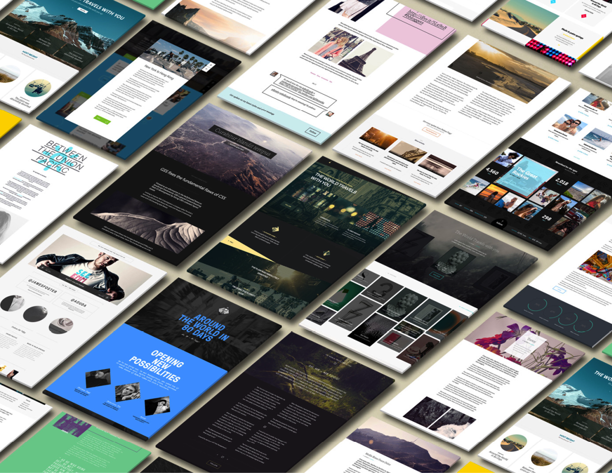
Figure 12-2
Some of the Grid’s earlier page views
Imagine taking any link from any website and pasting it into another website, and for the content that came with that original link to automatically take the shape and form of the new website. That’s essentially what Facebook previews and Twitter Cards do, in a very basic way. The information we see in various types of card-based designs, such as those in the Google app and the websites previously created with the Grid, are similar. However, with Google cards, no link is required. The information that is shown can be based on scraped data, a feed, or an API call. This kind of content fluidity places yet another level of complexity around the content we design, as we lose even more control of how users first come across it, experience it, interact with it, and potentially how it’s displayed. In addition, we’re now also increasingly designing for VUIs, and the user in some instances will have no visible UI at all. However, even in these instances, the interface is about modularity, not the least because VUIs return one result at a time, and from here, the user makes a decision on how to proceed.
Websites and apps as we know them probably still have a fairly long life span, but the fact that we’re increasingly experiencing them in parts rather than wholes is something we have to design for. From a storytelling and content strategy point of view, this change places even more emphasis on understanding the various contexts in which our content might be experienced (as we discussed in Chapter 7). This modularity is also about how it can tell and form part of a story together with content from other apps and websites.
Differences will always exist between device types in terms of―their suitability (or lack thereof) to be used in certain situations and locations, and the role they play in our day-to-day lives. However, with a clearly defined content strategy, defined templates for pages and modules, and conditional if-this-then-that rules to inform dynamic publishing, we’re in an incredibly exciting position to deliver experiences and content in a way that not only works for as many devices and sizes as possible, but also as many different and unique users as possible. This is one way in which we can better tell stories that resonate with users, specifically.
The Need to Focus on the Building Blocks Rather Than the Page or View
Before we can tell that story to users, we also need to tell it internally and to any clients. In the past, we presented one view of one page. Whether we had a wireframe or a glossy JPEG, we could say with certainty to clients and internal stakeholders what their website would look like, with a few differences between browsers. It was kind of like flipping through and showing pictures in a book or a brochure. The introduction of the first iPhone in 2007 that started to change that. We started to optimize the experience for mobile devices, mostly with custom mobile websites. With that mobile view added to the picture, the “one view” went out the window, and the more devices that appeared on the market, the more diverse and different that view of what the website would look like became.
As the challenges and costs involved with maintaining custom mobile websites grew, and as users’ expectation of being able to find the same content and the same functionality irrespective of the device increasingly became the norm, we started to design differently. Rather than focus on the pages, we started focusing on the building blocks, or modules, of those pages. Modular design and pattern libraries had been around for many years, as an attempt to streamline both design and development efforts, and to ensure more consistency in the UI that users were presented with. But it became more of a “thing” in 2010 onward,5 together with responsive design. Today, modular design through module and pattern libraries is something that is widely talked about and used.
When you work with modular design, each piece has a purpose and forms a part of something bigger, but also something that can adapt. As a starting point for responsive websites, we should aim to keep the core content and functionality the same and make sure that we can adapt it to the device and the screen in question. While we’re not at a point where our experiences are as fluid as John Underkoffler’s vision in Minority Report, in responsive design the content flows and adapts to the device in question.
Trent Walton, a web designer and founder of Paravel, talks of this flow as something we as designers and developers need to coordinate and calls it content choreography. It’s a beautiful expression that describes our job in a lovely way. Just like the choreographer of a beautiful ballet performance, we need to steer the movement of the content pieces so that, as he says, “the intended messages are kept at any device and at any width.” Through a methodology called content stacking, we define the order and the priority of the content across devices and screen sizes and, as we hit one of our defined breakpoints, how it should reflow into the new layout that we’ve defined. Seamlessly. To make this work, we need to work with modules within modules.
Approaching the UX, design, and the development phase in a modular way is the only way we’ll be able to ensure that our content can flow onto as many devices as possible, both current and future ones. It’s also the most rewarding and efficient way to both design and build, and it’s vital for ensuring that we can use dynamic publishing as a way to deliver content. This is so that what we design works, but more importantly, so that we can make sure it works for each of our users, no matter what entry point they come from, what they’ve seen or done before, and no matter what choices they make on where to go next. As with all things product design, there is value in finding ways to visualize these complexities, and here’s where turning back to CYOA can help inspire the product design process.
Common Patterns in Choice-Based Stories
Just as Kurt Vonnegut and Christopher Booker identified typical shapes and narrative structures in stories, various analyses have been made on the typical patterns of CYOA books and other choice-based stories and games. Sam Kabo Ashwell, a game creator, identifies a nonexhaustive list of eight patterns and structures. Many works will fall straight into one pattern, but others may involve elements of multiple patterns.6
|
[ note ] For the purpose of this book, the terms playthrough(s), game(s), and player(s), as used by Kabo Ashwell in his post, have been changed to story/stories and reader(s), respectively. |
Time Cave
The Time Cave pattern, the oldest and most obvious CYOA pattern, involves extensive branching (Figure 12-3). CYOA stories of this type tend to have relatively short storylines, and each choice leads to a different outcome, without any rejoining of the storylines. This pattern strongly encourages the reader to re-read the story.
This pattern has a lot of similarities with product design. The pattern has multiple endings, just as there are multiple endings and exit points in product design. Some are bad (marked in red), just as some endings in product experiences are unhappy. Though readers will re-read the story, they’re likely to miss a good deal of the content, just as users of a website are likely to engage and view only part of what that website holds. One main difference is that in the Time Cave pattern, all the choices the user makes are of roughly equal significance, which is not the case in the majority of product experiences.
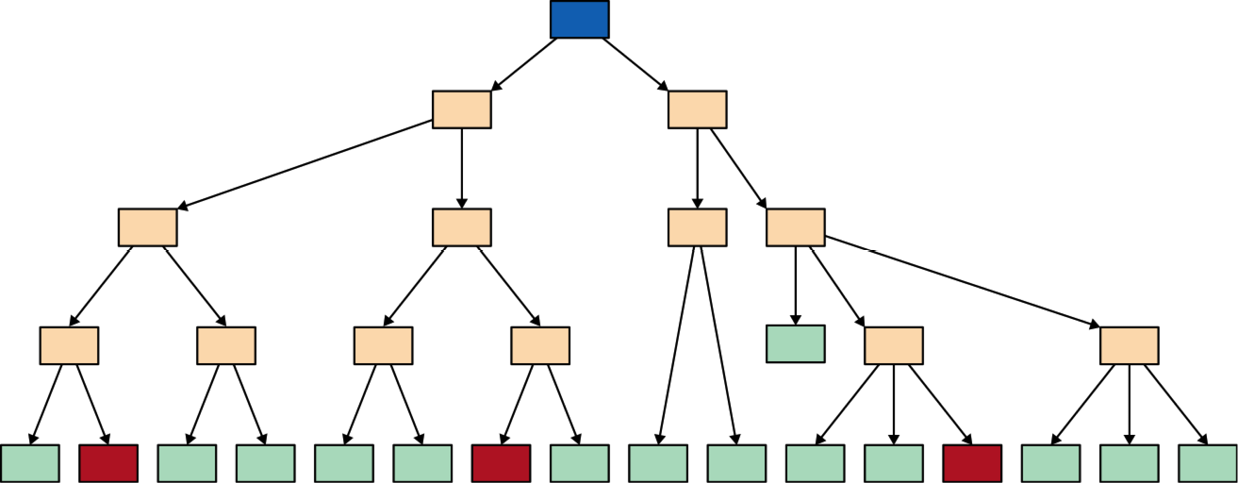
Figure 12-3
The Time Cave pattern
Examples of this pattern from traditional storytelling are The Cave of Time (Skylark Press) and Sugarcane Island (Vermont Crossroads Press), both by Edward Packard, as well as Emily Short’s game A Dark and Stormy Entry.
Gauntlet
In contrast to the Time Cave pattern, in the Gauntlet the central thread is long rather than broad, with branches that end in either dead ends, backtracking, or rejoining the central thread (Figure 12-4). Some branches have multiple endings, but in these instances they often stem from one final choice that the reader must make.

Figure 12-4
The Gauntlet structure
As Gauntlet structures usually tell one central story, they can be created in similar ways to a linear story. Most readers will also come across most of the important content, and it’s usually apparent to them that they are on one constrained path. Because of this, the presentation of the side branches are of great importance. In CYOA stories of this kind, the Gauntlet pattern can create an atmosphere of a hazardous or difficult world with uncertainties around whether going down one branch may lead to death, just a wrong answer, traveling back in time, a blocked path, or just some scenic details. This uncertainty is naturally not what we’re trying to evoke in most of the product experiences that we cover. However, this pattern holds a lot of similarities with more linear product experiences, such as task-based applications in which errors are illustrative of the dead ends, or “deaths” as referred to in the Gauntlet pattern.
Examples of the Gauntlet pattern in traditional storytelling are Zork: The Forces of Krill by Steve Meretzky (Doherty Associates) and Our Boys In Uniform, a game by Megan Stevens.
Branch and Bottleneck
In the Branch and Bottleneck structure, the story branches off but regularly rejoins, usually around common events that all versions of the story share (Figure 12-5). What makes this structure different from the Gauntlet is that it relies heavily on state tracking: a record of past choices and actions are tracked and used to determine what to present next. If there isn’t any state tracking, then you’re most likely dealing with a Gauntlet pattern.
This type of pattern in CYOA is often heavily governed by time and used to reflect the growth of the reader/character, allowing the reader to create a fairly distinct story while still keeping a quite manageable plot.
In general, Branch and Bottleneck stories tend to have quite similar storylines to begin with, and for the later state tracking to work, they need to be fairly large as well as involve enough time. This is in order to accumulate the changes that need to happen before it’s possible to show the result of those changes reflected in the storyline. This is similar in product design to needing enough usage and the right data around what users have seen and interacted with in order to deliver contextual, tailored, and personalized products.
An example of the Branch and Bottleneck pattern is the Long Live the Queen game; the pattern is also a guiding principle of Choice of Games and non-IF games.
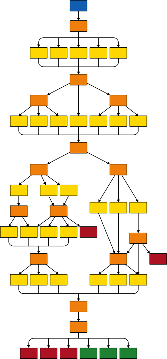
Figure 12-5
The Branch and Bottleneck structure
Quest
In the Quest pattern, distinct storyline branches are formed based on the decision the user makes (Figure 12-6). These branches tend to rejoin a small number of winning endings, often only one, and have a modular structure to each branch, with small tightly grouped clusters of nodes. There is generally no backtracking, and re-emerging is quite common. Quest structures tend to be large and include some form of state tracking, or they do poorly.
The tightly clustered nodes result in multiple ways to approach a single situation within one cluster, and there is a lot of interconnectedness. However, because the narrative is often fragmented or episodic, some parts of the story may not have any impact on the big picture. This is something we’re increasingly seeing in product design, with the number of possible entry points growing but without the specific touch point in question having much of an impact on the product experience itself, though each touch point is connected in terms of messaging and desired CTA.
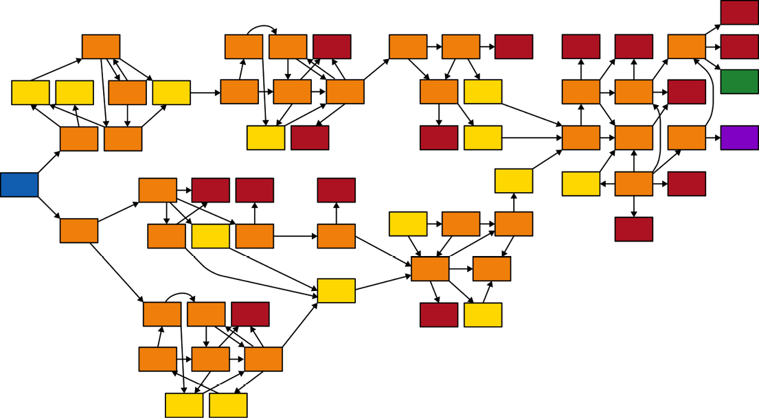
Figure 12-6
The Quest structure
The Quest structure category involves some of the biggest CYOAs and is well-suited for stories that involve purpose-led journeys of exploration and those that focus on setting, as they tend to be organized by geography rather than time. Examples of this structure are the Fighting Fantasy books by Steve Jackson and Ian Livingstone.
Open Map
In the Open Map structure, travel between the nodes is reversible, creating a static geography and a world in which the reader can explore and play indefinitely (Figure 12-7). Though time still plays a role, this pattern is structured by geography. This geography is often literal and relies on extensive state tracking, both explicit and secret, for the narrative to progress.
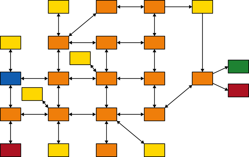
Figure 12-7
The Open Map structure
This pattern is often used to imitate the default style parser IF, and the narrative tends to become slower paced and less directed. There is plenty of time for reader to explore the world, and often they spend less time advancing the story. Thinking of product design, this resembles products of a social nature. An initial part requires learning about the platform before signing up. Thereafter, however, the main focus is on getting familiar with the platform. As that happens, exploration of the content and the different sections the platform contains takes over, and the narrative of the experience slows down.
An example of this structure in traditional storytelling is Chemistry and Physics by Caelyn Sandel and Carolyn VanEseltine.
Sorting Hat
In the Sorting Hat structure, the story branches heavily in the early game and rejoins heavily too, often transforming it into a Branch and Bottleneck structure where it’s determined which major branch the user gets assigned to. Often these major branches are quite linear, at times looking like Gauntlets. Other times they are choiceless, straight paths. Sorting Hat structures rely heavily on state tracking in the early game and bottlenecks when it comes to the decision points.
With its Branch and Bottleneck structure early on and the more linear structure in the second half, games with a Sorting Hat structure are a compromise between the breadth of the more open structures and the depth of the linear ones. Generally, the reader has a lot of influence over the way the story unfolds. Although it may feel like all choices will lead to the same thread, the author may at times end up having to write several different games.
Examples of this structure from traditional storytelling are the visual novel Katawa Shoujo (Four Leaf Studios) and the game Magical Makeover.
Floating Modules
The Floating Modules structure is possible only in computer-based works. In this structure, there are no trees, no central plot, and no through line, though there may be scattered twigs and branches. Instead, modular encounters become available to the reader either randomly or based on state.
In this structure it’s hard for the author to make assumptions about prior events and it’s generally a hard structure for the author to grasp. In order for the Floating Modules structure to work, it needs a large amount of content, or it tends to turn into a linear structure. When it comes to the play mechanics, these are largely about exposing stats to the reader.
Loop and Grow
In Loop and Grow structures, the narrative revolves around a central thread of some kind that loops around over and over and comes back to the same point (Figure 12-8). Because of state tracking, however, each time around, new options may be unlocked and others closed off. This pattern is very general and can coexist with many others.
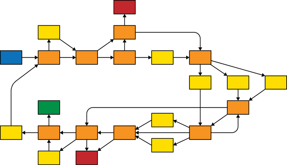
Figure 12-8
The Loop and Grow structure
In Loop and Grow structures, the regularity of the world is emphasized while still maintaining a narrative momentum. There generally has to be some kind of justification for why whole parts of the narrative repeat, and these are often related to the reader performing routine activities, engaging in time travel, or performing tasks. Because of the regularity of this structure, many stories of this kind involve a struggle against stagnation or confinement. Applied to product design, this structure resembles task-based applications and software with online banking examples. Looking at traditional storytelling, the games Trapped in Time by Simon Christiansen and Solarium by Anya Johanna DeNiro are some examples.
Key Principles from CYOA Structures Applied to Product Design
The preceding CYOA structures and accompanying diagrams are a lot smaller and simpler than the actual works (Figure 12-9). What they illustrate, however, like the typical shapes of stories (as covered in Chapter 9) is the basic pattern of different types of CYOA stories. These provide a foundation for understanding, defining, and working with different types of CYOA stories.
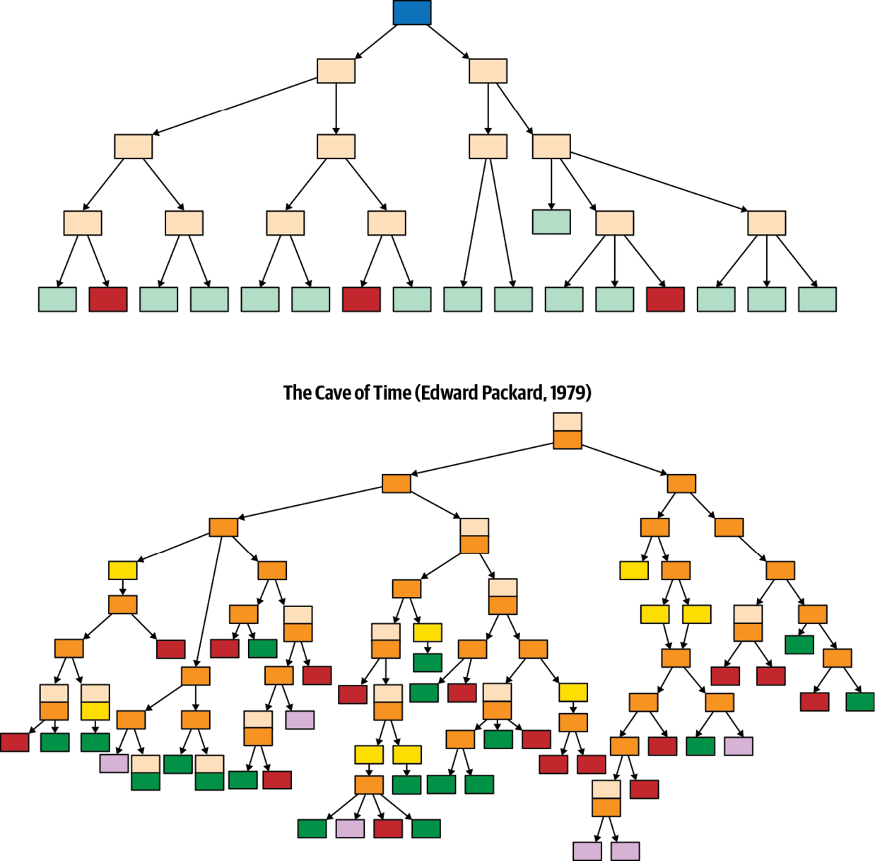
Figure 12-9
The Time Cave pattern (top) and map of the book The Cave of Time (bottom)7
Though there’ll always be exceptions, these CYOA patterns help identify some key principles that can guide authors in terms of how best to make their CYOA story work, as well as provide inspiration that sparks the imagination. Some of the principles are also of particular relevance to product design.
Branching Narratives
One of the main things about CYOA stories is the branching narratives that form from story nodes and the subsequent choices the reader makes. In some instances, the story has main and secondary branches, but in others, no branch of the story is more important than any other.
Applying it to product design
While all CYOA stories have to start from one central point, what makes product experiences so complicated is that they can start, and end, anywhere. Additionally, at any point the user can choose to go elsewhere, both through the CTAs that we’ve deliberately defined and designed into the experience, and also based on their own desires. The onward journey may involve using the main navigation, searching on the website or app, or even leaving it altogether.
The job for us is to, as much as possible, define and design the branches of the product experience narrative in such a way that they keep the user on track, for as long as it benefits them. Our goal is not to keep the user on our website or app just for the sake of it, or for the sake of an engagement metric, but to provide actual value and steer the user the best we can, even when that means off and away from our website or app.
A Central Thread
Some CYOA structures, like the Gauntlet, are structured around a central thread. Others have more branching structures, but in some instances, those branches can, in turn, have their own central thread.
Applying it to product design
In most product experiences, there is still a dominant branch, at least to begin with. Chapter 10 defined main plots and subplots; types of subplots are alternate journeys, unhappy journeys, and branched journeys. Here, the dead ends that some of the branches in CYOA stories lead to are most akin to unhappy journeys, whereas branches that rejoin are most akin to alternate journeys.
No matter what type of main plot and subplot we have in the product experiences that we define, a red thread should always be present, that through line that connects it all. Sometimes it’s more connected in the product narrative, and other times it’s more disjointed, but with a clear connection between the different parts nonetheless.
Story Nodes
Though some CYOA structures don’t have a central thread, all have nodes that bind the story branches together, and from where the reader makes a choice. These story nodes make up the backbone of the storyline and form a big piece of the CYOA narrative puzzle. Even if they aren’t directly linked through linear narrative, they connect to each other in a disjointed way. If you change something in one part of the CYOA story, it might affect a story node elsewhere.
Applying it to product design
In product design, there are always some key parts of the experience that bind it all together. Being able to see these pieces and how everything fits together is key for both CYOA stories and product experience design. When we talk about modular design and pattern libraries, we often talk about main modules and module variations.
A simple example is a hero module that when used on the home page has a certain layout, but when used on a secondary page has a slightly different and less “hero” layout (e.g., just showing a title and a CTA, while on the home page a description is included). Additionally, some key modules that are reused again and again make up larger parts of the pages and views, and these modules play a big part in pushing the user’s experience forward. Related posts are one such example.
Just as changing something in a CYOA story may have an effect elsewhere, often changing something in a module that is used on one page or view may also (involuntarily) change something on another page or view where that same module is being used. This brings us to the next principle, which is interconnectedness.
Interconnectedness
In order for the CYOA narrative to work, something needs to connect the story nodes to one another and to connect the reader to the nodes, or the story will fall apart. Many of the structures identified by Kabo Ashwell have a high level of interconnectedness. The one that stands out the most in relation to product design is the Quest structure, which provides numerous ways to approach a single situation.
Applying it to product design
This interconnected structure is similar to the multiple entry points we work with in product design: often numerous routes exist into the same page or view. Additionally, in product design everything is connected. As with the connected story nodes, each module that is being used to tell the story of the product is connected to other parts of the product experience through the same use of that module, as well as to the bigger picture. A change on one end might have an impact on the experience elsewhere. In addition, in order to ensure that you don’t end up with too many pieces in your content module puzzle, the general approach is to reuse the same module pattern and page or view layouts wherever it makes sense from a content, user, and business point of view.
State Tracking
In order to know which part of the story should be told to the reader next, and even to advance the story at all, many CYOA structures rely on state tracking. In turn, for the state tracking to work, the CYOA story itself needs to be fairly large and to allow some time to pass so that the change that is required can be produced.
Applying it to product design
State tracking is of particular importance because of the trends we’re now seeing in product design and marketing. As covered earlier in this book, and particularly in Chapter 3, there are growing opportunities for using data as part of the product experience to deliver more value to users. In order for this to work, we need to know what data to look at and what that content, in turn, should result in.
With the advances in IoT, smart homes, chatbots, and VUIs, we’ll increasingly become accustomed to interfaces that we talk to using more natural language, and those experiences will feel more personal. The rise of the tap-of-a-button expectations, providing access to everything at the tap of a button, is also doing its part in increasing users’ expectations of getting what they want, when they want it. Instant gratification is a thing, and soon that’ll start transcending our experiences on websites too, beyond what is already in place today.
The possibility to delivering tailored experiences through dynamic publishing is in one way quite similar to the CYOA books, only multiplied. At almost every single key point in the experience, there’s a possibility to give users what’s relevant to them specifically. That doesn’t mean that we’ll all necessarily have completely different experiences of the same website, but that what we see and how much we see of it will be tailored to us, based on where we are and what we’re using at that point in time.
Floating Modules
As mentioned earlier, the Floating Modules structure is one that is really hard for the author to pull off and one that’s possible only in computer-based works. Floating modules are mentioned only in the Floating Modules structure, so it’s not really a general principle. Still, it’s one that’s important to bring up in the context of product design because it reflects the way we increasingly are having to think about product experiences.
Applying it to product design
As we covered earlier in this chapter, increasingly we’re having to prepare for our content to go anywhere and for our user to be coming from and going to anywhere. As more product experiences take place away from the traditional page or view that we’ve so far been used to, we’ll need to think about product experiences as branched narratives made up of story nodes and floating modules with a high level of interconnectedness. Though we’re still able to, and even have to, visualize and define these branched narratives through the possible main plots and subplots that the product experience can take, we won’t be able to define all the possible variations. And that’s not required. However, having a framework for approaching these new types of experiences benefits us immensely, and this is where we can take some inspiration from how CYOA stories are worked through.
What Product Design Can Learn from CYOA
The core idea behind CYOA books is that the user will choose how the story unfolds. It’s based, of course, on predefined options, but nonetheless, what happens next is in the hands of the user. As much as we try to design the path that the users of our products and services should take, it’s almost always in their hands to determine when and where to begin and when and where to end. Naturally, there are points of no return where users are met with errors or unclear interfaces that cause an unwanted stop rather than a continuation of their journey, but overall, it’s up to the users to choose in which order, when, where, and how they’ll experience our product or service.
As we’ve covered so far in this chapter, there are a few similarities and shared challenges between CYOA and product design. Some of the challenges are the same, as well as some of the approaches that are taken to help with those.
Identifying Branching Narratives
In CYOA stories, the basic concept is to give the reader preselected choices for what will happen next. In some instances, there’ll be fewer choices, and in others, there’ll be more, just as in product design.
Much of what we’ve covered earlier in this book should help with identifying branching narratives. Working through the plot as covered in Chapter 5, and using something like the index card method, will help identify the points where the product narrative starts to branch off. Once you get into working with journeys and flows, and look at the main plot and subplots as covered in Chapter 10, even more detail is added. There are however, instances where the branches of the narratives are on more equal terms, if not equal, with each other similarly to the choices that the reader makes in CYOA stories. As one example of branched narratives, we work with machine learning and dynamic content that swaps out elements, whole modules, or in some instances whole pages based on active and passive choices that the user has made before, or not made, as well as based on data. Bots and conversational interfaces are also prime examples of experiences with branched narratives based on the choices that the user makes.
Applying it to product design
In product design, we don’t always take a systematic approach to identifying the different branches of the experience. However, working through key aspects can help you identify the branches and define the experience around it. Speaker Cassie Phillipps outlines four facets of branching stories and advises that you approach them in the following order:8
Story
Make sure you have a meaningful and impactful story and that you aren’t distracted by offering too many choices, as this can slow the story process and hurt the end result. Instead, focus on the outline to begin with and make the story loose enough to change but tight enough so you know the beat of the story works. Applied to product design, we must ensure that we have a clear understanding of what the experience narrative should be and that we don’t confuse the user of that experience with too many choices.
Branches
Your major branches should lead to a changes in scenes or characters as a result of the choice that is being made. The branches could also provide unique ways of reaching the same goal. Two ways to identify branches are to work backward from major conflicts or goals and to reorder scenes. Applied to product design, it’s particularly applicable to look at how the experience works if the user goes through it in a slightly haphazard way; for example, landing on a product page rather than the home page.
Dialogue
In meaningful story branches, the dialogue makes a difference. As much possible, it should be kept succinct because attention spans are short. In addition, to further the narrative, the characters should have unique voices and there should be clear consequences and goals tied to key parts in the dialogue.
Choices
When it comes to presenting choices in branching narratives, these can often be found in the characters’ possible reactions (e.g., will they respond X, Y or Z?). Other areas where choices often present themselves are in character defining traits like attitudes, and in unavoidable consequences. Creating choices requires paying attention to details, including giving each option appropriate weight, ensuring that each choice has a clear consequence, and avoiding bad choices. Bad choices may have the following characteristics:
- False—The player-character immediately negates the choice.
- Bad—The story interprets a different meaning than what was presented.
- Vague—The player doesn’t fully understand the options.
The same guiding principles can be applied to product design and, again, particularly to bots and conversational interfaces. The first aspect about choices can often be found in character reactions, is a useful one to keep in mind and tie back to the emotional response to a product experience.
Visualizing Content and Branching Narratives
As a reader of CYOA books, it can be quite hard to keep track of where you’ve come from. In the republished versions of the Choose Your Own Adventure books, the Chooseco publishing company included maps of the hidden narrative structure of the stories (Figure 12-10). Each arrow represents a page, a circle represents a decision point, the squares represent endings.9
Other than being lovely visualizations, these mappings show that the books don’t follow the same structure and that at times readers will have two, three, or even just one option at a decision point. Fans and bloggers such as Kabo Ashwell have been creating these visualizations for years. Another approach is to visualize the type of ending the different branches lead to, which is something that the computer scientist Christian Swinheart has done (Figures 12-11 and 12-12).
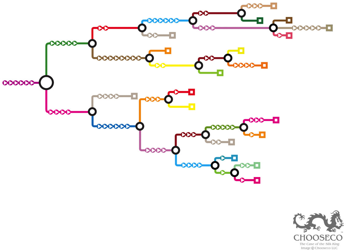
Figure 12-10
The hidden narrative structures in the CYOA book The Case of the Silk King, courtesy of Chooseco
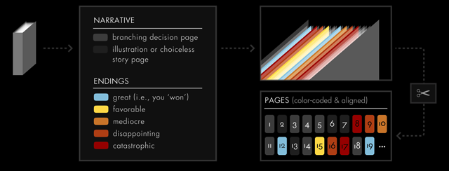
Figure 12-11
Visualization by Christian Swinehart where every page in the CYOA book has been color coded based on the number of choices offered and the goodness of the ending (http://samizdat.co/cyoa/)
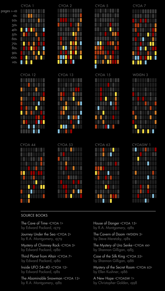
Figure 12-12
Visualization by Christian Swinehart of 12 CYOA books laid out next to each other with the oldest at the top, showing a gradual decline in the number of endings in the newer books (http://samizdat.co/cyoa/)
Applying it to product design
Many of the structures covered earlier in this chapter relied on state tracking to a lesser or greater extent to identify what the next part of the story should be. In product design, particularly when dynamic elements are included, having defined the criteria for swapping out one module for something else is key. This criteria might mean that just one module is changed and the rest of the product story remains the same. Or it may be that the product experience branches off from there based on data about the user as well as actions, or lack thereof, that they’ve taken.
When we think through and plan out content for the experiences that we design (websites, apps, bots, voice-based, or physical experiences), we can draw a lot from CYOA and visualizations of these stories. Those who have worked on a complex piece of software or website know how beneficial flow charts are for both defining and designing for each eventuality. The more complex the software or experience, the more value in and need for ensuring that all eventualities are captured, from what a user might do, to the response of the system, including error messages and pages.
Summary
Users’ journeys to, with, and onward from our products are becoming less linear and often start in the middle rather than at the home page, which we’d previously considered the beginning. As a result, the need to ensure that the UX works no matter what is ever more important.
As we’ve covered in this chapter, branching narratives will always exist in product design, just as they do in traditional storytelling. With the number of devices and connected homes on the rise, the complexities of what we’re designing are increasing. But the opportunities are increasing, too. Though we’d like to think that we can control how the user moves from one part of the experience to the next, the best thing we can do is to embrace our loss of control. It’s up to the users to choose how and what they interact with and for us to ensure that the experience works no matter what their selections are.
CYOA stories teach us about the power and beauty of letting the user define how the story is told, and show us that being clear about our choices helps us ensure that the experience story comes together. CYOA also provides useful references for visualizing the complexities and seeing how the various parts of the experience come together. It can also help us define what content to show next, or what module to show instead of a default one based on who the user is, their context, and which part of the product narrative that they’ve so far experienced.
In the next chapter, we’ll take a look at using storytelling to bring all of this together into pages and views that tell a clear and valuable story to the user.
1 Brad Frost, “For a Future-Frienly Web,” Brad Frost (blog), October 2, 2011, https://oreil.ly/lqubX.
2 Urstadt, Frier, “Welcome to Zuckerworld.”
3 Paul Adams, “The End of Apps as We Know Them,” Inside Intercom (blog), October 22, 2014, https://oreil.ly/T3UCw.
4 Frederic Lardinois, “The Grib Raises $4.6 Million for Its Intelligent Website Builder,” TechCrunch, December 2, 2014, https://oreil.ly/IU8Xh.
5 Erin Malone, “A History of Patterns in User Experience Design ,” Medium, March 31, 2017, https://oreil.ly/ikWIe.
6 Sam Kabo Ashwell, “Standard Patterns in Choice-Based Games,” These Heterogeneous Tasks (blog), January 26, 2015, https://oreil.ly/wL0Yf.
7 Sam Kabo Ashwell, “CYOA structure: The Cave of Time,” These Heterogenous Tasks (blog), August 5, 2011, https://oreil.ly/Jvdaf.
8 Cassie Phillipps, “All Choice No Consequence: Efficiently Branching Narratives,” Game Narrative Summit, 2016, https://oreil.ly/qdV2A.
9 Sarah Laskow, “These Maps Reveal the Hidden Structures of ‘Choose Your Own Adventure’ Books,” Atlas Obscura, June 13, 2017, https://oreil.ly/rNO2C.
